You’ve spent months tweaking the hero copy, swapping colors, adding AI chatbots, and switching to the latest landing page builder. According to the Brixon Group, even after making several changes to your landing page, you might still feel dissatisfied with the results and choose to redesign it once more.
Then it happens again. Another week passes with the same effect on your company, and you are not scaling.
If this sounds familiar, you’re not alone. Many founders misdiagnose the landing page problem. They think they need prettier pages when the real issue is how the page frames the decision. For a broader look at the usual suspects, see our post on 5 reasons your website isn’t converting.
Here’s the uncomfortable truth: the landing page isn’t broken because of bad design or copy. Instead, it’s broken because you never defined the decision that the page is supposed to create.
In this blog, we will break it down for you:
- Why most founders optimize execution too early?
- the exact order that actually drives conversions,
- and how to fix it without redesigning everything.
Why Your Landing Page Isn’t Converting (Even With Good Traffic)
Traffic isn’t the issue for most of you reading this. You already have that. Leads are coming in through ads, referrals, or content.
The real problem, however, is that visitors don’t know what decision they’re supposed to make, why they should make it now, or what happens after they do.
When a landing page lacks decision clarity, founders compensate by redesigning pages, adding tools, or driving more traffic. But none of that fixes a broken conversion sequence.
A landing page doesn’t fail because it looks bad. It fails because it asks the visitor to think too much or choose between too many things.
A few couples of visitors are coming into your page, and they are becoming successful deals, which is better than having too much traffic but not converting.
So before you optimize copy, design, or automation, you need to fix the order of operations.

Why founders get trapped in the wrong order
Many of you follow a familiar sequence:
1. Build or redesign a landing page.
You pour energy into colors, fonts, and layouts. You want your site to look “professional,” but design is treated like a paint job instead of a conversion system. Research shows users reward clarity, relevance and frictionless experiences. When pre-click and post-click messages don’t match, visitors feel misled and leave.
If you’re still sending paid traffic to a generic homepage, you’re likely wasting budget; learn why in our breakdown of homepages versus landing pages.
2. Run traffic and hope for results.
Ads, organic posts, and webinars bring visitors to your page. If conversions are low, you might think the problem is your CTA or traffic source. Adding more CTAs and small promos only confuses visitors and makes things harder. As we explain in Why Your Business Doesn’t Have a Traffic Problem but a Conversion Problem, more traffic rarely fixes a broken funnel.
3. Iterate copy and visuals
You tweak headlines and button colors, hoping small changes will solve a bigger problem. But clarity is more important than just being simple. Facebook’s Julie Zhuo says people often focus too much on simplicity and style, forgetting about clarity. Good design should feel invisible—you only notice it when it’s a problem.
4. Add automation and AI.
Trying to grow quickly, you add chatbots, email tools, and AI copywriters. But if the process isn’t right, AI just speeds up what’s already there.
Process experts warn that AI is artificial acceleration: it magnifies the maturity of your processes, good or bad. Deploying AI on top of messy rules automates contradictions faster instead of correcting them.
For a deeper dive into this concept, read Don’t Automate Chaos, which explains why you need structure before adding AI.
The result? Conversions stay unpredictable because you tried to fix execution before fixing the decision problem.
Focusing on campaigns first leads to vanity metrics, not real revenue. Recent research shows 55% of campaigns don’t get positive ROI, and 60–70% of B2B content isn’t used. Buyers only spend 17% of their time talking to suppliers. The rest happens in the “dark funnel,” like private chats or anonymous research. In this situation, you can’t just be more creative; you need to change the order of steps.

Introducing the DECIDE model
To fix conversion problems, start thinking like a decision architect. Each landing page should guide your target audience to make one clear choice. The DECIDE model gives you a step-by-step process:
1. Define the Decision
Identify the one main decision you want your visitor to make. Is it to book a call, start a free trial, or request a quote? Vague options like “learn more” just cause confusion. You can only improve what’s clear. Before picking colors or tools, ask yourself, “Which decision will move my business forward?”
Decision‑first marketing asks who needs to move, what decision they need to make, and when they’re receptive.
2. Establish Evidence
If you make claims without proof, people get skeptical. B2B buyers want transparency. Trust signals like client logos, case studies, real results, and testimonials help lower risk. Make sure your proof matches your visitor’s concerns—show examples that fit their situation, not just general praise. You can also use psychological triggers to encourage action; these principles explain why some proof works better than others.
3. Clarify the Path
Make the conversion path clear and focused. Remove extra CTAs. Use layout, whitespace, and helpful images to guide visitors. Good design should feel invisible—people only notice it when it’s bad. Visitors should know in five seconds what your company does, what they get, and how to get it. For more tips on layout, see our guide on high-converting landing pages.
4. Identify Friction
Every extra form field or confusing step adds friction. Shorter forms work better than long ones. Try to answer common questions about integration, pricing, timing, or security before visitors ask. The more certain they feel, the more likely they are to convert.
5. Design Follow‑Up
Conversion doesn’t stop at the click. You need a clear follow-up system to handle leads every time. Without clear rules, founders end up doing manual work. Use AI to help only after you set up the right logic and boundaries. Clarity comes first.
According to research by Heiding and colleagues, AI-automated campaigns achieved results that were 350 percent better than the control group, showing that well-structured automated sequences can significantly outperform unplanned outreach.
6. Evaluate Continuously
Landing pages aren’t just static brochures. Use analytics, A/B tests, and feedback to see where visitors get stuck. Check heatmaps and drop-off points often. Update your content as your offer changes. Regular improvements turn your page into a real conversion tool.
Remember this order: each step builds on the last. If you try to fix friction or test CTAs before defining the decision, it’s like rewiring a kitchen before you know what you want to cook.
Here Are Example Scenario
1. The service founder with no landing page
Scenario: A consultant sells high‑ticket strategy sessions. She drives traffic from podcasts and LinkedIn posts straight to her homepage, which is a portfolio. Visitors scroll around, watch a few testimonials and click “Contact.” She manually replies to every inquiry. Conversion rates are unpredictable, and she believes she needs a flashy landing page.
Wrong problem first: She spends weeks building a new landing page with fancy graphics and AI‑generated copy. But she still hasn’t made the decision. Is it to book a free discovery call? To request a proposal? Without clarity, her new page features three CTAs (“Book a call,” “Download a guide,” “Join my newsletter”), splitting attention and lowering conversion.
Right order: She applies the DECIDE model. She defines the decision: “Schedule a 30‑minute discovery call this week.” She gathers two client testimonials that address her prospects’ biggest fears (“Will this be worth my time?”). She creates a simple landing page with a clear headline, one CTA (“Book your call”), and a three‑field form. An automated confirmation email includes a calendar link and a pre‑work questionnaire. She reviews behaviour analytics weekly. Conversion rates double because the page now guides one decision instead of scattering attention.
2. The founder with a low‑converting landing page
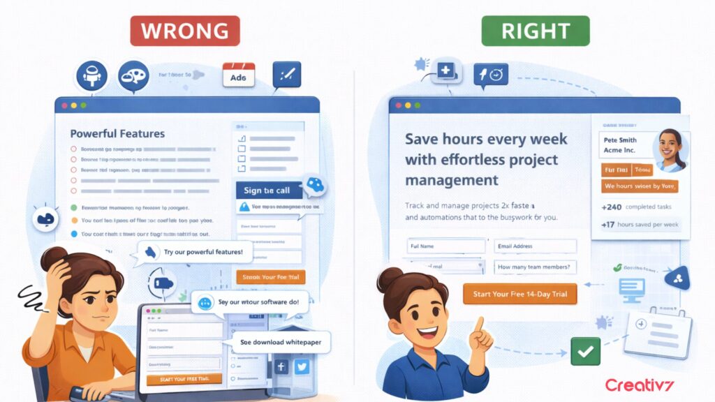
Scenario: A SaaS founder has a landing page for a free trial. Traffic comes from ads and webinars. The page lists dozens of features, a long form requests 10 data points, and there are secondary CTAs (“Download whitepaper,” “Follow us on social”). Conversion is stuck at 2 %. The founder keeps rewriting copy and changing button colours.
Wrong problem first: She optimises surface elements while ignoring decision clarity. Visitors don’t understand what the product does or what they get. There is no proof it works. The long form and multiple CTAs introduce friction. When she adds AI chatbots, they simply repeat the confusing messaging, amplifying the problem.
Right order: Using the DECIDE model, she defines the decision: “Start a free 14‑day trial today.” She then rewrites the hero section to state the problem solved and the outcome delivered in plain language. Next, she reduces the form to name and email, adding a single qualifier (“How many team members?”). Then, she adds a case study with quantifiable results next to the form to establish evidence. Finally, she removes secondary CTAs and repeats the trial CTA at logical scroll points. She implements a simple 3‑email onboarding sequence that triggers after sign‑up. Conversion increases to 7% because the path is clear and friction is reduced.
3. The founder with automation, but manual rescue
Scenario: A B2B service founder uses a sophisticated marketing automation platform. Leads enter via webinars, then flow through complex sequences. However, he still finds himself personally following up on promising deals and writing custom emails to get contracts signed. He concludes that his automation tool is insufficient and starts looking for AI agents to “close deals for him.”
Wrong problem first: He seeks more automation without clarifying the decision points in his funnel. His sequences deliver generic nurture emails and random content. There is no single decision anchor (“Book a scoping call”), so leads wander. When he adds AI, it amplifies the randomness because AI thrives on structure and clarity.
Right order: He maps his buyer journey and identifies the critical decision: “Commit to a paid pilot.” He redesigns his sequence around that decision. After a webinar, the follow‑up emails focus on the pilot offer, addressing typical objections (cost, risk, time to value) with case studies and testimonials. He establishes rules: if a prospect clicks the pilot FAQ twice, they receive a personal email from sales. If not, they receive an educational piece. He uses AI to schedule calls and personalise reminders, but only after the logic is defined. As a result, fewer leads slip through; deals close faster because the follow‑up aligns with the decision.
Final Thought
It’s easy to want new tools or another designer when results slow down. But the best growth hack isn’t a tool, it’s clarity. Define the decision first and let everything else follow. If you’re thinking about a redesign, check out the six questions in our website redesign guide before you start.
Your funnel isn’t a mystery. It’s just a series of small decisions. When you map out these micro steps, the big decision becomes clear. To learn how to spot and track these steps, check out our primer on micro-conversions. For a full system to turn visitors into customers, read our six-step conversion blueprint.
If you want a personalized growth tip to double your conversions, book a free 15-minute session.